Bears Eat Beets: The Minnesota Wild logo essay
When the Minnesota Wild logo was initially unveiled back 1998, the context in which sport was perceived would, essentially, change forever. Whether we knew it or not, one man’s artistic recreation of a “wild” would be enough to permanently alter the memetic landscape of professional athletics.
If the simplistic nature of the New York Yankees’ interlocking letters set the bar for artistic achievement, the Minnesota Wild reinvented the sport of proverbial high jump altogether. It is for this reason that the cultural smorgasbord of Minnesota’s organic Nature Bear deserves your respect.
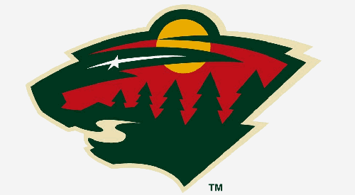
Love it or hate it, the unparalleled appeal of the seemingly acid trip-induced creation is two-fold. The first and most defining characteristic of the infamous logo being it’s optically-deceiving double image – representing both a wilderness landscape and an unidentified wild animal – and the second, of course, being the fact that bears are totally bad ass.
Though the predominant theory suggests bear, many believe the form depicted on the emblem is that of a wild cat. The franchise itself, however, has refused to distinguish between the two, referring to the creature as a “wild animal” and nothing more. As a one-time northern-based, but otherwise-unqualified, source, this sports writer says bear due to the obviously rounded ear and bearlike girth of neck.
Besides, bears are awesome, you know that.
[php snippet=1]
Though the war wages on between Teams Ursidae and Felidae, perhaps a more telling (and more recognized) component of the logo is its incorporation of the state’s environment. With traditional evergreens accompanying both moon and stream, the complexity of the image is what makes it unique in North American professional sport.
Consider then, the fact that the white star that makes up the bear’s eye also pays homage to the region’s former NHL franchise (the Minnesota North Stars) and the case for Wild superiority, in terms of aesthetics at least, is all but closed.
Add to the logo’s case the fact that it symbolizes one of just seven non-plural team names in all of North American professional sport (and the only one of 122 franchises based on an adjective) and you have yet more reason to appreciate the power of the multidimensional Nature Bear.
Though the team has more or less just recently shed its expansion team tag in the National Hockey League, the fact that its artwork alone is enough to anchor an art school curriculum speaks to the overall state of hockey in Minnesota.
Combine with that a remarkable attendance record and one of the most hockey-passionate state populations in all of America and the Minnesota Wild are slowly rising to the upper echelon of NHL franchises.
It’s hard to imagine such an obnoxiously modernized franchise in the conversation with sport’s finest, but before too long, fans will find just that. Whether they ever truly acknowledge the unconventional logo amongst that same elite, however, remains to be seen.
…because seriously, it has a hidden bear on it.
[php snippet=1]