Reliving the 90s: An NBA jersey experience
Over the course of the past few decades, NBA jerseys have shown plenty of character. As with anything we wear, certain looks go in and out of style. While jerseys may change from year to year and generation to generation, we see them occasionally return to the court during special retro nights.
Not only do we see them on our favorite teams, we see them in abundant stock at sports memorabilia stores, in music videos and elsewhere in popular culture, like video games. NBA 2K11 featured a record breaking selection of historical jerseys for each team. Fans want retro jerseys.
Reflecting back on the threads of yesterday serves as a reminder of decades past, each jersey symbolically representing its own era, but that doesn’t mean the outlook in 2011 isn’t better off than in the past.
You might have noticed that the Boston Celtics, Chicago Bulls, L.A. Lakers and New York Knicks – four organizations bursting with history – don’t often alter their logos and uniforms.
Each of these four teams’ home and away jerseys are simple and classic. The Celtics’ green and white, Chicago’s red and white, the Lakers’ purple and yellow, and the Knicks’ orange and blue are all schemes that have transcended generations.
Simply put, the organizations got it right the first time and have never looked back.
But not every organization has found the magic formula, some have gone through countless redesigns over the years. Other organizations actually have come up with classic designs that have withstood the test of time, but have chosen to go through with various redesigns anyway. Whether it’s been to spark a renewed interest in the club, to discover new fans, or just “fit in”, remains to be seen.
[php snippet=1]
Whether right or wrong (you be the judge), the 1990s were a time when many teams experimented with their uniforms, taking graphic design to a whole new level. Looking back with the convenient advantage of hindsight, present day jersey connoisseurs can only ask one question: “What were they thinking?”
It’s not that all jerseys in the 90s were terrible – certainly not. The Orlando Magic and Miami Heat debuted with excellent logos and uniforms.
The Philadelphia 76ers came out with a new set of jerseys that became synonymous with the era, despite the unnecessary departure from a patriotic red, white, and blue. When people think Allen Iverson, they think of him in that jersey.
But for some unknown reason, and there’s really no other way to put it, more awful jerseys were designed in the decade of the 90s than in any other.
The Grizzlies and Raptors: expansion teams with attitude!
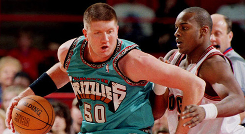
The Vancouver Grizzlies and Toronto Raptors came into the league as expansion teams in 1995. Color schemes aside, it appears that both organizations were attempting to appear as threatening as possible. The Grizzlies slapped a very angry looking bear on the front of the jersey, and then another giant bear on the side of the shorts – actually, the entire side of the shorts.
The away jerseys themselves were a bright shade of teal, a color which for some reason took over the NBA during the decade. Teal would have been fine on its own, except that the grizzly bears on the jersey retained their natural brown color. The jerseys were also trimmed with an odd, brown pattern. Teal and brown: not a good color scheme. The black road jerseys they came up with eventually were a great relief, and the current Memphis Grizzlies jerseys are some of the nicest in basketball. It just took them a while to get it right, apparently.
The Raptors’ logo was a velociraptor with a threatening set of teeth and a menacing glare. Had it not been wearing a basketball jersey with the letter “R” on it it may have been a perfect way of capitalizing on the loyalties of the Jurassic Park generation of sports fans. It didn’t help that his claws were also sticking out of a pair of sneakers.
Compounding that with the scribbled font for the logo and the numbers, a purple color scheme and jagged pinstripes, you have to wonder if they weren’t trying to make the strangest jersey imaginable. Though they were promptly abandoned, they’ll always hold a place in the heart of many Raptors fans as the first the franchise saw. Still, we should be thankful today that their current set of jerseys is much, much nicer.
The SuperSonics, Pistons, and 76ers: from classic to forgettable
The strangest facet of the whole 90s jersey phase was that classic teams were discarding classic and traditional jerseys without much thought at all. It luckily worked for some, but not for most others. It’s possible to forgive teams like the Vancouver Grizzlies and Toronto Raptors for their participation in the apparent craze. They were expansion teams, after all, just trying to fit in.
But teams like the Detroit Pistons, Seattle SuperSonics, and Philadelphia 76ers (of the early 90s) had no such excuse.
For some reason, the Sonics decided that their classic green and yellows wasn’t working. They added a wine red, darkening both the green and yellow in the process, and gave the font a cartoonish twist. For good measure, they gave the text a nice, solid red shadow too and proceeded to dot the “i” with a basketball. The list of subtleties goes on and on, which is hardly a good thing.
The Sonics also added the Seattle Space Needle to the main logo, which in itself is a nice piece of architecture and obvious symbol of the city. This was probably the best addition to the Sonics’ branding scheme, but it never showed up on the jerseys themselves. Luckily, before the team moved to Oklahoma City, they returned to a modernized version of their old green and yellow classics.
The Detroit Pistons were one of a few teams to join the previously mentioned teal brigade – and they were the worst of the bunch. Thankfully, the red, white, and blue classic jerseys have since returned. For a while, Pistons fans had to deal with a bucking horse with mane made of flames. Yes, flames.
Perhaps the worst part of the scheme is that it can singlehandedly be held responsible for an entire generation believing that a piston is a type of horse. Apparently, the organization thought that putting a horse in the logo would represent horsepower, thus relating it to automotive pistons.
The Philadelphia 76ers, as previously mentioned, came up with a successful redesign in the late 90s. But before that, they had already struggled in their conversion from the classic Sixers garb. The franchise really milked the whole patriotism angle on this one. Let’s not even get into how the stars themselves are a red, white, and blue gradient.
Perhaps that is why they strayed from the obvious red, white, and blue on the following jerseys, which were a success. Still, both sets of jerseys have since been abandoned, and the Sixers have returned to their roots with their current jerseys.
The Utah Jazz and Houston Rockets: just plain bad, but oddly understandable
After they moved from New Orleans, the Utah Jazz struggled with their identity as an organization. As a result, when they finally redesigned their logos and jerseys, they attempted to connect with the population of their new location. So, they put an entire mountain range on their jerseys. And their shorts.
These jerseys will always be remembered as the ones worn by the team Michael Jordan played against in his final two championships. They aren’t necessarily ugly – but the the color scheme could have used some work and contextually they’re a nightmare. The Jazz probably should have just changed their team name (which would have allowed the current Hornets to take the “Jazz”). Still, at least they have returned to their musical roots with their recent 2010 redesign, but it sure was a long time coming.
Meanwhile, the Houston Rockets, sensing that their red and yellow jerseys of the past were going out of style, ditched the yellow and adopted navy blue. They also added giant pinstripes to their jersey, turned a basketball into a planet and drew a cartoon rocket flying around it. All of which seemed like a good idea at the time.
Greats like Charles Barkley, Yao Ming, Hakeem Olajuwon and Scottie Pippen have all donned these beauties, which makes judging them objectively difficult. They were appealing in a sense, as the Rockets previous jerseys had always been very plain and yellow, but the design is more fitting for a fan t-shirt than for something players would actually wear on the court. It’s simply too cartoonish and features too many conflicting graphics.
The Hawks and Bucks: seriously, what were they thinking?
The Atlanta Hawks had long been remembered for a similar design to the Rockets: yellow and red. In the 90s, they went a completely new direction with their logo, but tried to retain the previous colors. For the most part, it worked okay – except for one road jersey in particular. A red to black gradient on a jersey might be one of the worst ideas in history, but it doesn’t take top billing. That honor belongs to the unessential giant red hawk sitting right in the middle of the gradient, which forced the essential number onto the left shoulder.
The Milwaukee Bucks got in on the fun with a devastating alternate jersey in the mid 90s. Luckily, it only stuck around for a couple years. The fact that they made a green jersey with thick, darker green pinstripes is mind-boggling enough. That they put a giant, fading purple deer on top of such a jersey is simply the cherry on top.
The pinnacle of 90s jersey design doesn’t even belong to one team in particular though. In 1995, the NBA All-Star Game rolled out purple jerseys for the Eastern Conference, and white jerseys for the Western Conference, both splattered with cartoonish images and an oddly irregular font.
Now, I applaud the NBA as a whole for their recent All-Star jerseys, which have all been excellent, but even as a child could sense that the 1995 jerseys should have never seen the light of day. Unfortunately, other All-Star jerseys from the decade weren’t much better.
Thankfully, we’ve moved on into a new era of jersey design. For the most part, every team’s jerseys appear to be on their way up as teams continue to strive for the best possible appearance. With TV coverage at an all time high, there’s simply no more time to look bad. Graphic design technologies are improving every day and that can only be a good thing.
In the overall scheme of things, maybe jerseys designs don’t matter. The game on the court, obviously, is what makes the difference. But since fans support their franchise by wearing their colors in the form of shirts, jerseys, and other apparel, teams owe it to the fan base to give them something pleasant.
While some of these jerseys may have found their way into the hearts of their fans, we can only hope that they never find their way back onto the court.
[php snippet=1]