Dark days in NHL jersey design
I can’t be the only one who’s noticed how jersey design in the NHL has taken a giant leap backwards recently, as though everyone responsible for coming up with creative crests coincidentally managed to save their worst work for the past few seasons.
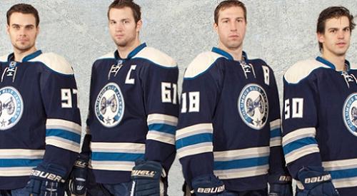
Case in point, the Columbus Cannons. Although they may have been trying to keep with the theme of paying homage to Ohio’s Civil War history, the resulting crest leaves much to be desired. Did the traditional Blue Jackets emblem not accomplish that in a far more creative, and not to mention stylish manner? Unless of course they’re hoping to appeal to some vast untapped market of Civil War recreationists. Or perhaps it’s a nod to the team’s explosive power? Your guess is as good as mine.
To Columbus’ credit, at least they came up with something, as lackluster as it may be. That’s more than can be said for the Colorado ‘Colorado’ or the Dallas ‘Dallas’, among others. I’m talking about the teams that chose to abandon any semblance of a logo and go back to basics, sporting nothing but the city’s name and in some instances the player’s number on the front of their sweaters.
Is it that these clubs have such a presence in the league that they see no need for a distinctive crest? Or, perhaps more aptly, do NHL fans need to be reminded that a franchise even exists in some of these cities? Either way, even teams in tyke or novice leagues proudly sport a logo and most of the time they don’t even know who’s end their playing in.
Then there are the teams who kick it up a notch and add their nickname in the way of some minuscule font under whichever city name is proudly emblazoned across the front. That’s the case with Minnesota and Buffalo, who at first glance appear to have saved money on their alternate jerseys by sharing the same design. Now there’s nothing wrong with a little hometown pride, but in professional sport, is the nickname not of equal importance? Don’t they deserve more than an honorable mention in an unseen fold of the jersey?
[php snippet=1]
The Sens and Bolts sure think so. Well, sort of. They definitely get an ‘A’ when it comes to making the nickname the star of the show, but a resounding ‘F’ in the creativity department. Unless, of course, points are awarded for clever shortening of the official nickname.
And let’s not ignore the epidemic that is the throwback jersey. As much as people in today’s hectic world yearn for days gone by, I’m not convinced that nostalgia necessarily applies to jerseys. Yes Edmonton, I’m talking about you. You too Calgary and the New york Islanders. There’s a very good reason those sweaters disappeared in the 80s. Your blinding color schemes in high def quality broadcast are painful. Now, there’s no need to go adopting a gatling gun or bowie knife logo, but is it too much to ask that you just stick with what’s worked so well for the last decade or so? Crazy, I know.
Finally, no commentary on hideous jerseys would be complete without the Pittsburgh Penguins, a team in a league all their own. Two words; baby blue. In what most consider one of the physically toughest sports in North America, what right-minded franchise decides that it’s a good idea to outfit their gladiators in a color generally reserved for newborns?
As talented a club as the Penguins are, it’s hard to take them seriously when they’re sporting those jerseys. I’m actually at a loss for how the players themselves even agreed to take to the ice in those aberrations. I suspect it has a lot to do with the confidence that results from being one of the most talented teams in the NHL. Unfortunately, talent has absolutely no bearing on style.
So what are these design and color-challenged teams to do?
For starters, take a page from some of the more successful franchises in the NHL. Detroit, Montreal, Philadelphia, New Jersey and Toronto to name a few. Two jerseys (Toronto’s vintage third jersey notwithstanding), home and away. They realize that they don’t need to mess with perfection. They have a tried and tested logo that gets the job done and they save the flash for their performance on the ice. What all of these other teams fail to realize is that their constant uniform changes only serve to confuse their already fickle fans.
See for yourself the next time you tune into a Columbus-Atlanta game where they’re sporting their alternates. You’d find yourself hard pressed to immediately identify which two teams are even playing. And imagine the frustration of shelling out $100-plus only to have the team scrap that jersey entirely (not that I foresee huge demand for any of the aforementioned sweaters, anyway).
The moral here is simple, if it ain’t broke, don’t fix it. And if it is broke, please, don’t make it worse.
[php snippet=1]